Visualizations
Learn how to use the visualizations in the Pick-up and Delivery Routing model to validate route plans, detect bottlenecks, and understand how jobs are sequenced across drivers.
The Pick-up and Delivery Routing model provides three complementary visualization views:
-
Map view: Get a spatial overview of all driver routes across your service territory.
-
By driver: Validate individual driver schedules as a Gantt-style timeline.
-
By job: Review each job’s pickup and delivery stops and their scheduled time windows.
Used together, they transform an optimized route plan from a black-box output into an explainable and continuously improvable operational plan.
Most stops are a pickup or a delivery, and a job can also include intermediate service stops.
Across all three views, an up triangle (▲) marks load added to the driver’s vehicle (a pickup) and a down triangle (▼) marks load removed (a delivery).
A block labelled 0▼ 2▲, for example, represents a stop where nothing is delivered and two units are picked up.
Map view
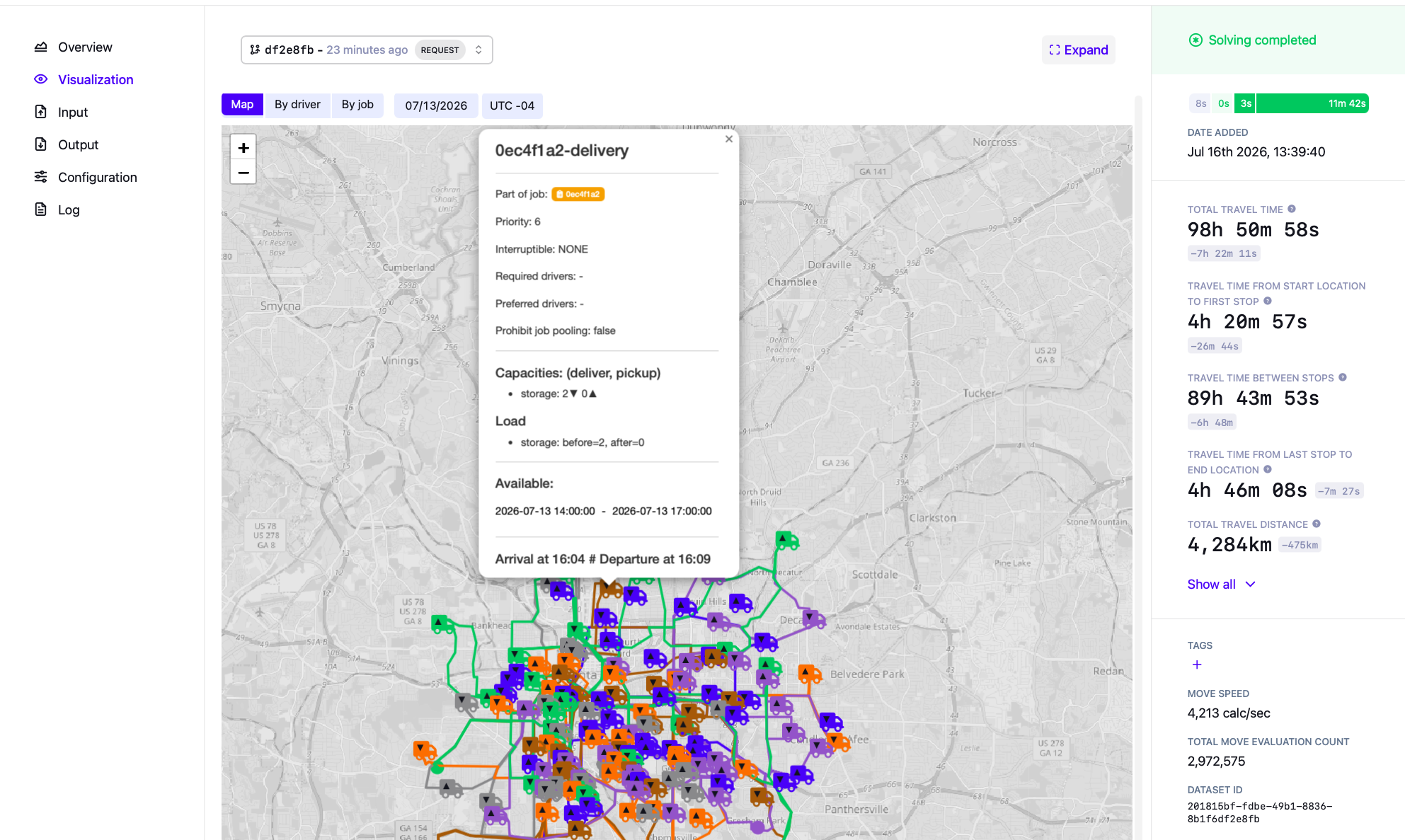
Primary focus: Spatial overview of all driver routes.
The Map view displays all driver routes for a given day on a zoomable geographic map. Each driver is assigned a distinct color, and their full route is drawn as a colored line tracing the actual road path taken between stops.
The map includes:
-
Route lines: Colored paths showing the road network each driver follows.
-
Driver markers: Vehicle icons showing each driver, colored to match their route.
-
Stop markers: Pickup (▲) and delivery (▼) markers at each stop location, color-coded by the assigned driver.
The spatial layout makes cross-route patterns immediately visible: which drivers stay central, which cover outlying areas, and where routes overlap or backtrack.
Click any stop marker to see its details, including:
-
The job the stop belongs to, its priority, and whether it is interruptible.
-
Any required or preferred drivers, and whether job pooling is prohibited.
-
Capacities: the load delivered (▼) and picked up (▲) at the stop.
-
Load: the vehicle load before and after the stop is completed.
-
The stop’s available time window, and the arrival and departure times.
When to use
Use the Map view when you want to:
-
Get a quick geographic overview of the day’s route plan.
-
Identify drivers covering disproportionately large or small territories.
-
Spot route overlaps or backtracking that may indicate reassignment opportunities.
-
Communicate the plan visually to stakeholders.
By driver
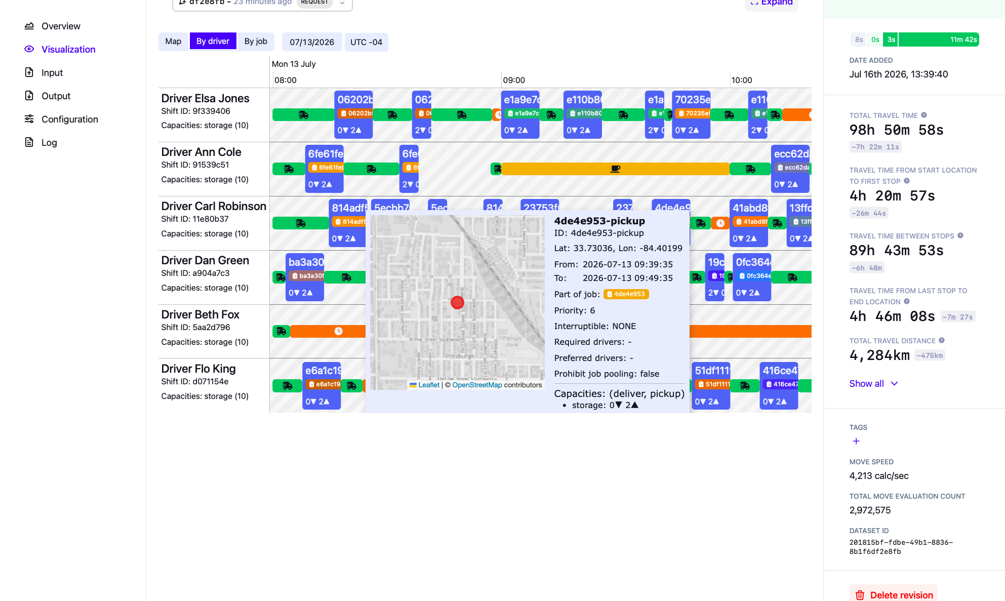
Primary focus: Detailed driver-level schedule validation.
The By driver view shows the route plan as a Gantt-style timeline where each row is a driver and each block is a scheduled stop. The left of each row shows the driver’s name, shift ID, and vehicle capacities.
Each stop block displays:
-
The job ID the stop belongs to.
-
The load change at the stop, shown as delivered (▼) and picked up (▲) amounts.
The view also shows:
-
Travel segments: Green segments with a vehicle icon between stops, representing travel time.
-
Waiting time: Orange segments with a clock icon, where a driver arrives before a stop’s time window opens and must wait.
-
Breaks: Blocks with a break icon representing scheduled floating or fixed breaks.
-
Shift boundaries: Greyed-out hatching at the edges of the working day, outside the driver’s shift.
-
Overtime: An extension beyond the shift boundary when a driver has allowed overtime.
Hover over any stop block to see a tooltip with detailed information about that stop, such as its coordinates, time window, the job it belongs to, its priority, and its capacities.
When to use
Use the By driver view when you want to:
-
Validate the full daily schedule for a specific driver.
-
Check whether breaks are placed correctly within each driver’s shift.
-
Identify drivers who are waiting excessively or running over their shift window.
-
Confirm that pickups and their corresponding deliveries are sequenced correctly within a route.
-
Explain individual assignments to dispatchers or fleet managers.
By job
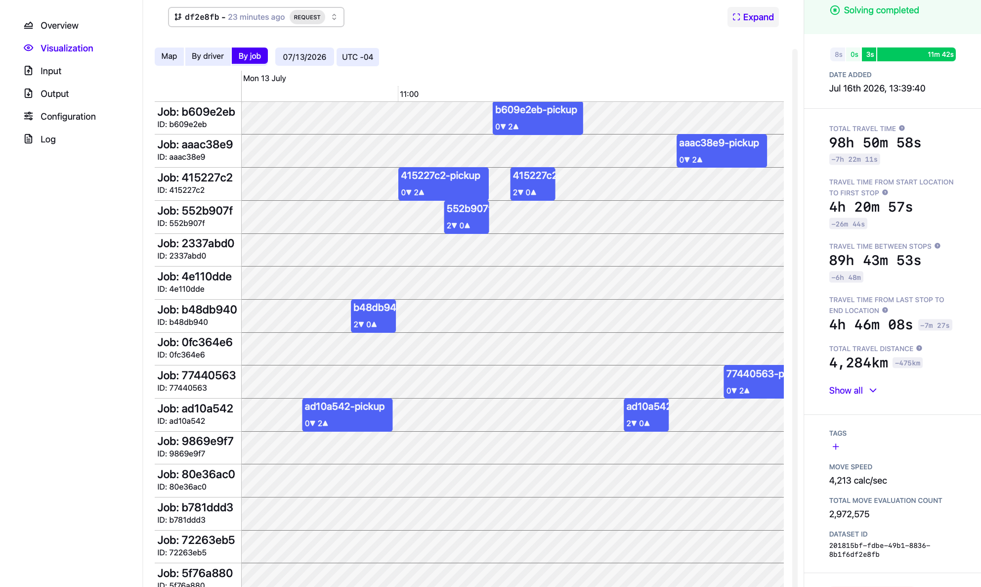
Primary focus: Job-centric assignment and time window validation.
The By job view shows a timeline where each row is a job and each block represents one of the job’s stops at its scheduled time. The left of each row shows the job name and internal ID.
Each block displays:
-
The stop name, indicating whether it is a pickup or delivery.
-
The load change at the stop, shown as delivered (▼) and picked up (▲) amounts.
Because a job’s stops appear together on one row, you can see the full pickup-to-delivery span for each job and confirm that stops are completed in the correct order. Unassigned jobs appear as empty rows with no blocks, making it easy to spot gaps in coverage at a glance.
When to use
Use the By job view when you want to:
-
Check that all jobs have been assigned.
-
Verify that each stop is scheduled within its required time window.
-
Confirm that a job’s pickup is completed before its delivery.
-
Identify jobs left unassigned because of missing skills, tags, or unresolvable constraints.
-
Review the customer-side view of the plan (as opposed to the driver-side view).
Recommended analysis workflow
A structured approach:
-
Start with the Map view to get a spatial overview of the day’s routes.
-
Switch to By driver to inspect individual driver schedules and detect overruns, excessive waiting, or misplaced breaks.
-
Use By job to confirm all jobs are assigned, sequenced correctly, and within their time windows.
-
Use these insights to inform strategic decisions and test different scenarios with the dataset comparison UI.
Next
The visualizations help you understand the what of a route plan, which is a first step to understanding the why and the so what.
-
For guidance on how to validate and explain optimized plans, see the Validating an optimized plan with Explainable AI guide. This guide explains why trust and explainability matter when presenting a plan to planners and stakeholders, and how to check correctness, understand trade-offs, and communicate why certain assignments were made. It shows how visualizations, real-world metrics, and explainability features work together to build confidence in a plan rather than treating it as a black box.
-
For a broader view on diagnosing and resolving operational bottlenecks, the Uncovering inefficiencies in operational planning guide provides useful context. It discusses common sources of planning inefficiencies (such as under- or over-utilization, skill mix issues, and demand imbalances) and how planning optimization can help you pinpoint structural problems in your operation.
-
Once you’ve identified a scenario worth testing, use the dataset comparison UI to systematically compare it against your baseline before applying it to production.