Comparing datasets (preview)
|
This guide describes functionality that is currently available as a preview feature. If you’d like early access to this feature, please Contact us. |
The Comparison UI of the Timefold Platform helps you assess and compare multiple datasets at a high level, enabling better-informed decisions about your planning problems. Whether you’re testing new goals, configurations, or different scenarios, the comparison view brings clarity to the impact of each change.
When to use the Comparison UI
The comparison UI supports several key use cases:
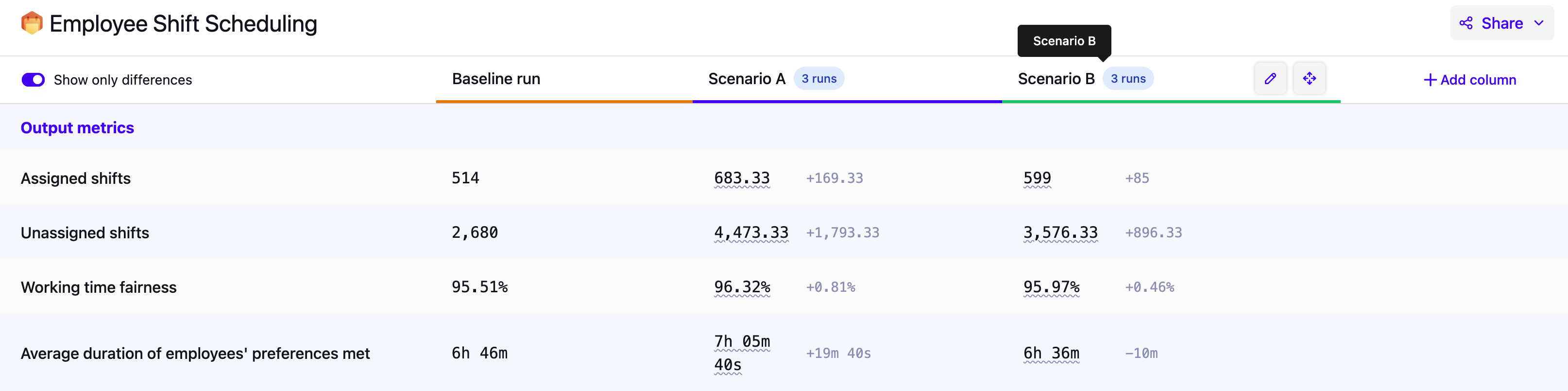
Goal alignment
Solve the same planning problem with different optimization goals, and compare the outcomes. This helps you understand the trade-offs between competing priorities and make informed decisions about what matters most.
Learn more: Balancing different optimization goals.
Benchmarking
Compare solutions under different termination settings, or hardware configurations. This helps you assess the quality and speed of the model and identify potential areas for improvement.
What-if scenarios & scenario testing
Make simulated changes to your planning problem, such as increasing workload or modifying resource capacity, and compare the outcomes. This helps you make strategic operational decisions with confidence.
Compare two time periods side-by-side
Pin a set of datasets from one period and a set from another period, then compare them directly. Unlike Insights, which tracks aggregate trends automatically, this lets you drill into the full breakdown for two specific periods you choose, which is useful when you want to understand why a metric changed between, say, Q1 and Q2.
|
The Comparison UI is designed for high-level analysis of the specific datasets you select manually. It’s not intended for tracking trends across all runs over time. To monitor how KPIs evolve across many runs historically, use Insights instead. It’s also not intended for comparing specific employee metrics or resource assignments. For detailed plan visualizations, use Dataset Visualizations. |
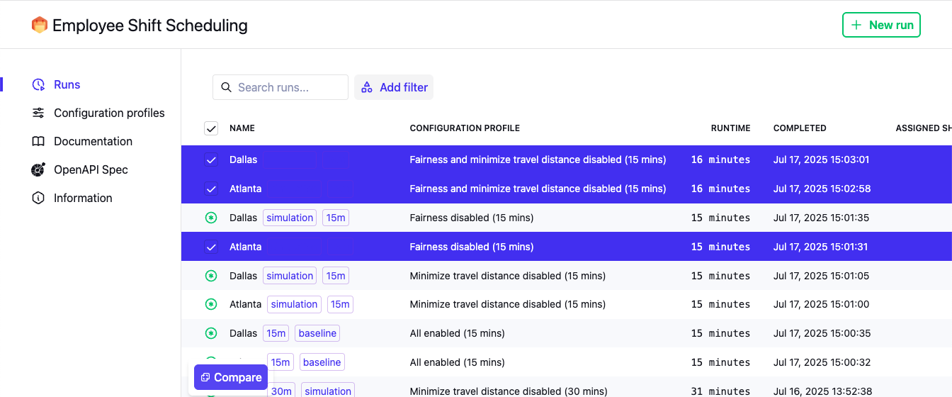
Starting a comparison
You always start a comparison from the Plans Overview. Select two or more of your datasets and click Compare at the bottom.
From the Comparison UI you can:
-
Re-order columns by dragging the handle icon in the column header.
-
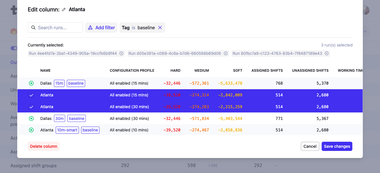
Edit or remove a column by clicking the pen icon in the column header to change which datasets are used for the column, and give columns a different name.
-
Click Add column at the top right of the table to add more columns to the comparison.
| The order in which you select datasets from the Model Plans Overview will decide the order of the columns in the Comparison UI. To avoid dragging, make sure you select your baseline dataset first. |
How comparisons work
Each column in the comparison represents either:
-
A single dataset: Best when you want to see detailed metrics for each dataset.
-
A group of datasets: Best when you want to look for patterns and trends across multiple datasets. When a column represents multiple datasets, the values shown will be averages. Click the pen icon on a column and select multiple datasets to aggregate them in a single column.
|
Use tags to categorize your datasets and scenarios. When editing a column in the Comparison UI you can then filter on these tags to quickly find the relevant datasets. Learn more here: Searching and categorizing datasets for auditability. |
You can compare up to:
-
10 columns in total.
-
50 datasets per column.
What we compare
Each comparison shows different types of metrics to help you interpret and analyze your results. Some information is only shown when a column represents a single dataset.
-
Output metrics:
These are the main results of your planning problem and are usually the most important to compare. They are ordered by the priorities defined by your model. -
Input metrics:
These describe the size or scope of the problem (e.g. number of tasks, employees, vehicles). They help you put the output metrics in context. -
Score:
The hard, medium, and soft scores of the datasets. -
Constraint scores (single-dataset columns only):
The per-constraint score breakdown for each run. Scores are color-coded and sorted using the score analysis sort order. This lets you dive deeper than the high-level total score and pinpoint exactly which constraints are performing differently between the datasets you’re comparing. -
Calculation metrics:
These relate to the solving process (e.g. number of moves, move evaluation speed), and help you assess solver performance. -
Dataset info:
Displays metadata about each dataset, such as the Dataset ID and dates. -
Configuration (single-dataset columns only):
Displays the configuration parameters used for that dataset, including termination settings, constraint weights, and other configuration parameters. This lets you quickly spot differences in the configured optimization goals between the datasets you’re comparing.
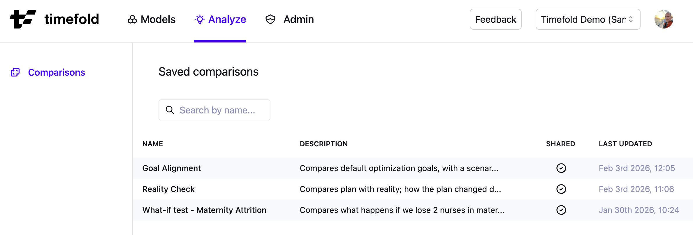
Saved comparisons
You can save comparisons to easily return to them later or share them with colleagues. Saving a comparison preserves both the selected datasets and the way the comparison is configured.
To save a comparison:
-
Start a comparison as usual.
-
Click the Save button.
-
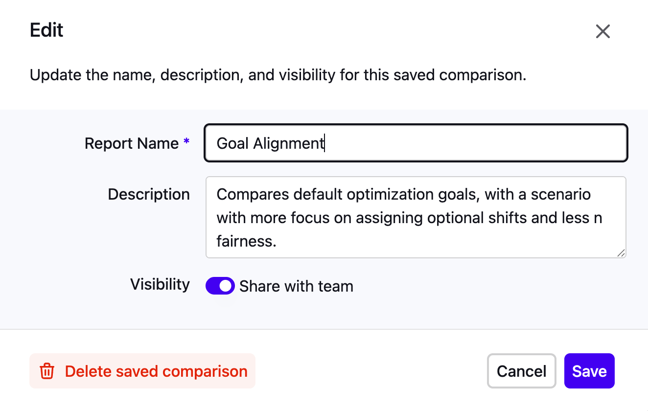
In the Save dialog:
-
Give your comparison a Name and optional Description to explain its purpose.
-
Choose whether the saved comparison should be visible only to you or shared with your tenant members.
-
Any custom column names you’ve assigned will also be saved, making it easier for others (or yourself later) to understand the context of the comparison.
-
Click Save to persist the comparison.
-
Saved comparisons are stored in the platform and can be accessed later via the Analyze → Saved Comparisons menu item.
Changes made to saved comparisons (e.g., updating column configurations, renaming, or changing visibility) are logged in the Audit log for traceability.
Options and tips
-
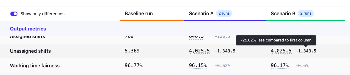
Difference versus baseline:
Differences from the first column are shown in dimmed text. To compare against a different baseline, reorder the columns. Hover over a difference to see it as a percentage. By default, differences are shown as absolute values. To display them as percentages instead, open Choose metrics and toggle Show differences as percentage.
-
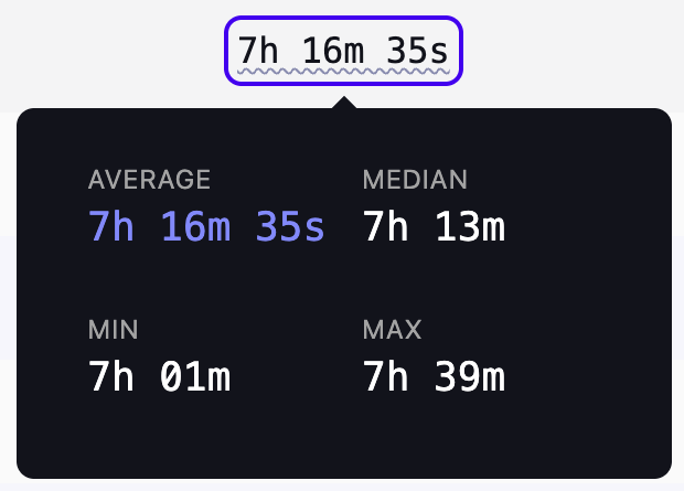
Distribution tooltips:
If you’re comparing a group of datasets, you’ll see underlined average values. Hover to reveal the min, max, median, and average.
-
Customizing priority metrics:
Click Choose metrics to control which metrics appear at the top of the comparison table and in what order. Use the drag handles to reorder entries, toggle individual metrics on or off.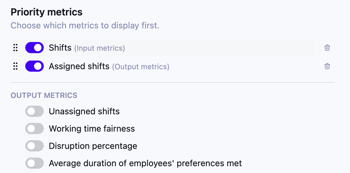 Figure 8. Choose metrics dialog
 -
Radar chart (3 or more metrics):
When comparing datasets, you can enable a radar chart at the top of the comparison view. The chart overlays the selected metrics for each column (single dataset, or group of datasets) as a polygon, giving you an instant visual diff across the different columns.To enable it, click Choose metrics and toggle Show radar chart on. Use the dropdown selectors to choose which metrics are plotted on the chart axes — at least 3 metrics must be selected.
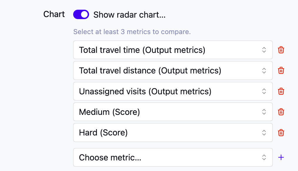 Figure 9. Set-up of the radar chart with at least 3 metrics
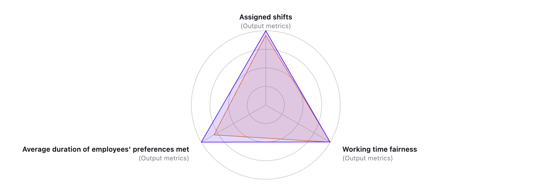 Figure 10. Radar chart showing selected metrics
Hover over an axis to see a tooltip with the percentage delta for that metric alongside its absolute value, making it easier to compare columns at a glance.
Once the radar chart is enabled, you can export it as an SVG image via Share → Export radar diagram (SVG), for example to include it in a report or presentation.
-
Only show differences:
Inside the Choose metrics dialog, toggle "Only show differences" to hide rows where metrics are the same across all columns. -
Sharing results:
You can save a comparison, give it a descriptive name and add conclusions in the description. Share the saved comparison with your tenant members or generate a PDF export of your comparison. (We recommend using landscape orientation for better readability.)
Example questions the Comparison UI can answer
Here are some example questions the Comparison UI can help you answer:
-
How did the staffing efficiency change this month compared to last?
-
What would happen if we added more part-time employees?
-
How does the total driving time change when we prioritize early deliveries more?
-
Is the solution quality significantly better when using a longer solving time?
-
What’s the impact on service SLA’s if we lost a service team?
Preview status
|
This feature is currently available as a preview feature. If you’d like early access to this feature, please Contact us. |