Interpreting dataset results
In this guide you will learn how to interpret the results of a dataset using the Platform’s UI, understand the metrics, analyze the scores, and possible next steps on how to use and tweak the proposed planning solution.
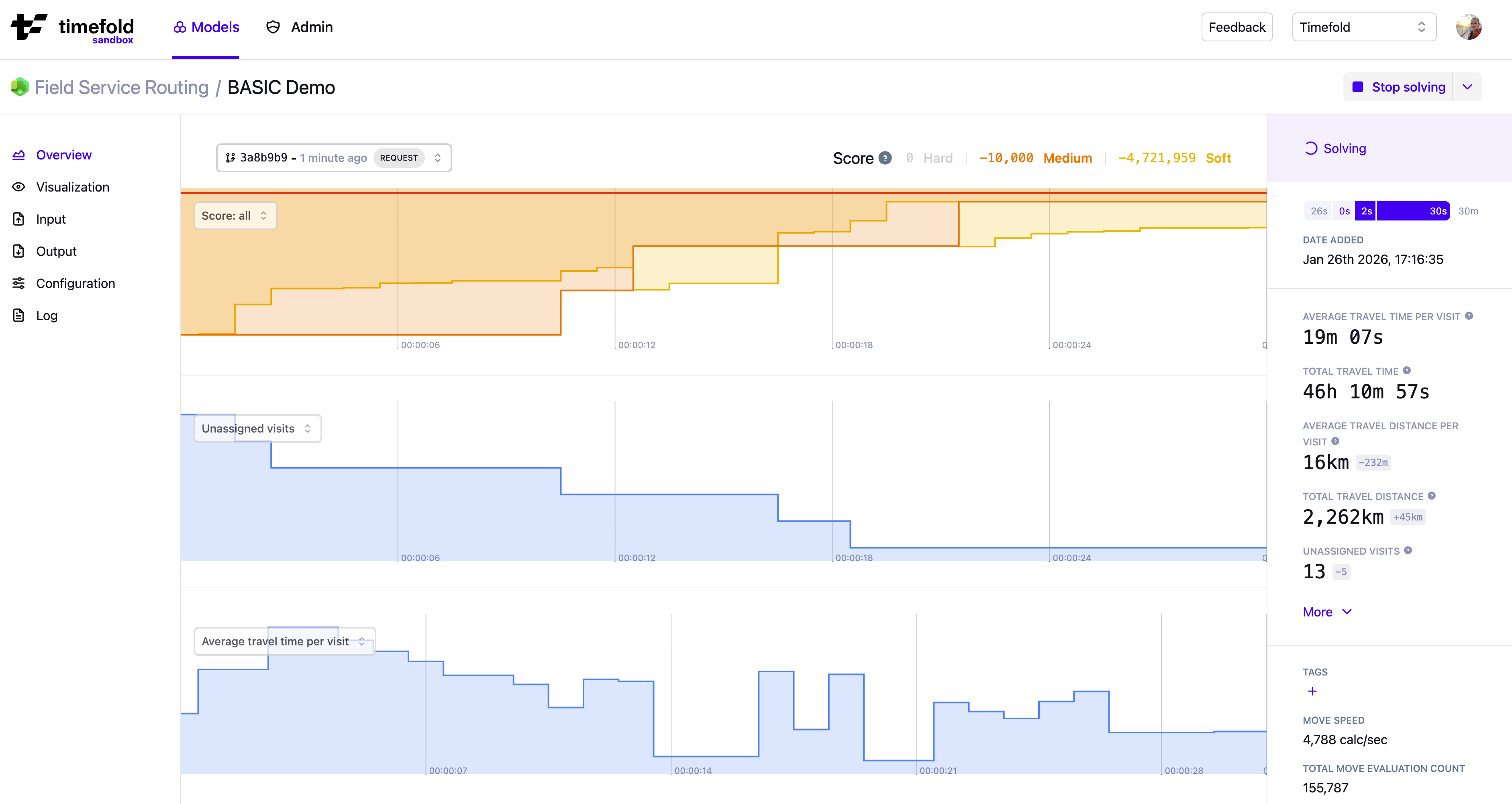
The dataset’s overview page gives you a summary of the status and results from the dataset. Find this page by clicking the tile of a model, and then picking a dataset from the Plans overview table.
The detail page has the following sections:
-
Sidebar on the right, with (in this order):
-
The dataset’s status
-
The dataset’s timeline
-
The dataset’s output metrics
-
The dataset’s other properties
-
-
Main section, with (in this order):
-
Optionally, any validation, warning or error messages.
-
The dataset’s solve graphs (with e.g. the hard, medium, and soft scores).
-
The dataset’s input metrics
-
The list of constraints with their score analysis.
-
Sidebar
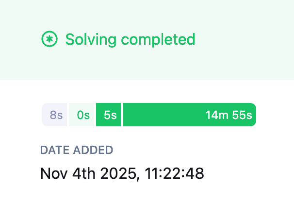
Dataset status and errors/warnings
A dataset’s status is indicated at the top right in the sidebar.
Learn more about the different statuses here: Dataset lifecycle.
If there were any errors or warnings related to the dataset (e.g. input validation) the overview page will show them.
Dataset timeline
The timeline widget shows the different stages the dataset has been in, and for how long. Hover over each of the stages to see when they started and how long they took.
Dataset output metrics and optimization gain
Each model defines its own output metrics. These are metrics that reflect the problem domain. Metrics give an indication of the quality of the provided solution.
The sidebar shows the values of all metrics for the final solution, along with the optimization gain for each metric.
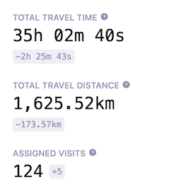
Optimization gain is defined as the difference between the first and the last solution.
| When interpreting optimization gain, avoid focusing on a single metric in isolation. Instead, consider how different metrics relate to and influence one another. |
By default, we display the five most common metrics. You can view additional metrics by clicking More.
Metrics are ordered by most commonly relevant ones first.
Sometimes a metric will be displayed as --.
This means it’s not applicable for the current dataset, e.g. the metric "Visits within SLA" will be displayed as -- if no SLAs are defined for visits in the input data.
Dataset properties
Below the dataset’s metrics we show the other properties of the dataset:
-
Any Tags added to the dataset. You can easily add more tags or edit existing ones. Use tags to make datasets easier to find and compare. Learn more here: Searching and categorizing datasets for auditability.
-
The Move speed. This is an indicator of how quickly Timefold is exploring different solutions and Timefold’s performance.
-
The Total model evaluation count. Total number of candidate solution changes the solver evaluated while searching for the best solution.
-
The Dataset ID.
-
The Parent ID and Origin ID, shown only if the dataset was created from another dataset. The Parent ID refers to the dataset from which this one was directly created. The Origin ID refers to the very first dataset in that chain.
Main section
Solve graphs
Timefold Platform provides interactive graphs and metrics to help you understand how your model behaves during solving and how solution quality evolves over time.
Scores and solution quality
The score of a dataset is an indication of its quality. The higher the score, the better the constraints are met, and the more optimal the provided solution is.
We distinguish between hard constraints, medium constraints, and soft constraints and compute scores for each.
- Hard constraints
-
Hard constraints are the basic rules of the domain and must never be broken. If they are broken, the solution isn’t even feasible.
- Medium constraints
-
Medium constraints usually incentivise Timefold to assign as many entities as possible. They are used by Timefold to allow for overconstrained planning.
- Soft constraints
-
The soft constraints of a model represent the optimization objectives. They can be broken, but the more they are satisfied, the more optimal a solution is.
Timefold always optimizes scores in the following order:
-
A higher hard constraint score to find a feasible solution.
-
A higher medium constraint score to assign as much as possible.
-
A higher soft constraint score to optimize the solution.
Each score is the sum of the individual constraint scores, grouped by constraint type.
Default score graph
By default, Timefold displays the Score Graph, which shows the evolution of the hard, medium, and soft scores during the solving of a dataset.
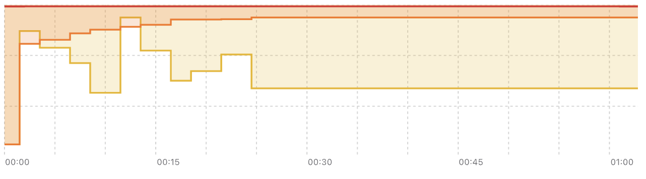
When you hover over the score graph, you’ll see the values for each of the scores and the metrics of the solution at that time and the difference to the first solution.
To focus on a specific section of time in the score graph, you can zoom in by selecting the section you are interested in. To zoom back out to the entire score graph click Reset Zoom.
By exploring the evolution of scores and metrics, you’ll get a glimpse into the dynamic of the model; how it balances the different constraints and what the effect on the metrics are.
Configuring and combining graphs
In addition to the default score graph, you can customize which graphs are displayed using the graph selector drop-down in the top-left corner of the graph area.
With this selector, you can:
-
Switch between different metrics.
-
Add additional graphs to the view.
-
Remove graphs you no longer need.
You can display up to five graphs simultaneously.
For each graph, you can choose to display:
-
The evolution of any output metric produced by the model.
-
The evolution of the hard, medium, or soft score individually, instead of combined in a single graph.
This allows you to focus on a specific aspect of solver behavior without visual noise from unrelated metrics.
Persistent graph settings
Your graph configuration is automatically saved. When you return to the same model run or open a new run, the previously selected graphs and layout are restored.
This makes it easy to maintain a consistent analysis setup across multiple solver runs.
Understanding correlations and tradeoffs
By displaying multiple graphs side by side, it becomes much easier to spot correlations between different metrics during solving and observe tradeoffs between score levels and business metrics.
By exploring the evolution of scores and metrics together, you gain insight into the dynamics of the model: how it balances different constraints and how those decisions affect solution quality.
These insights can directly influence how you tune constraint weights and evaluate whether the solver is prioritizing the right objectives at the right time.
Input metrics
Below the solve graphs is an overview of metrics related to the input. They give an indication of the size of the planning problem you’ve submitted. These help put the metrics in context.
Score analysis
The score analysis table shows a list of constraints defined by the model, grouped by functionality and ordered by score. Constraints are grouped logically to make it easier to identify related ones and understand how they influence the overall solution quality.
Each constraint includes the following information:
-
Name: The label used for the constraint.
-
Type: Whether it’s hard, medium, or soft.
-
Impact: Whether it contributes a penalty or a reward.
-
Matches: The number of times this constraint was not fully satisfied.
-
Weight (effective): The weight used by the model when computing scores.
-
The effective weight can be
0if the model disables the constraint because it is not used or triggered in the current solution. -
The effective weight may differ from the configured weight. To see the configured weight, go to the dataset’s Configuration page.
-
For guidance on adjusting weights, see Balancing different optimization goals.
-
-
Score: The contribution of this constraint to the score of its type.
Some constraints have special indicators next to their weight:
-
⛔️ Disabled constraint: A constraint that was disabled by the model (because there is no related data or it is not applicable in the current solution) is shown with a weight of
0and a no-entry icon. -
🔒 Locked constraint: A constraint for which you cannot change the weight is shown with a lock icon. These weights are fixed by the model and cannot be modified through configuration profiles.
|
If you configured a non-zero weight (for example, There is no change in the endpoint’s output, only in how the weight value should be interpreted (effective versus configured). |
Use the dropdown at the top-left of the score analysis table to choose which constraints are displayed:
-
Show matched (non-zero score): Displays only constraints that actually affected the solution’s score - penalty constraints that were violated or reward constraints that contributed positively.
-
Show triggered (non-zero weight): Displays all enabled constraints that can influence the score, including penalty constraints that were fully satisfied and therefore contributed no penalty.
-
All constraints: Displays every constraint defined by the model, including those that were disabled for this run.
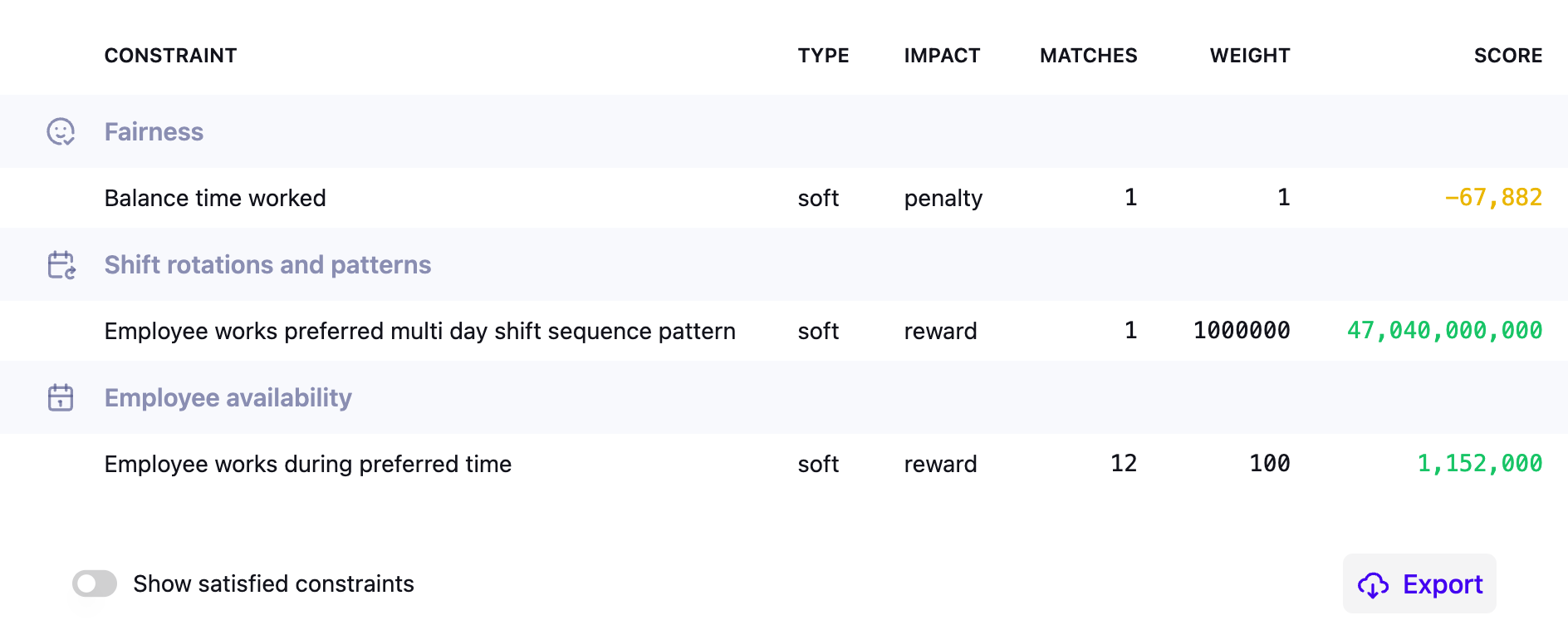
The image shows a selection of constraints for a dataset of the employee scheduling model.
Click Export to export the justifications for a solution to a .json file.
Planning solution output and visualization
A visual representation of this plan can be found on the Visualization page. The goal of this visualization is to spot-check the quality of the output.
The full details of the solution can be found under Output. You can download the output as a JSON file with the full details of the plan.
Using the API
The information from this overview page is also available by using the Model’s API.
-
The
/{id}endpoint returns the best solution, including its metrics. -
The
/{id}/metadataendpoint returns the status of a dataset and any validation errors or warnings. -
The
/{id}/score-analysisendpoint returns a list of the constraints, their scores, matches, and justifications.
For more information about the API endpoints, go to a model’s API Spec page.