Insights (preview)
|
This guide describes functionality that is currently available as a preview feature. If you’d like early access to this feature, please contact us. |
Insights lets you track the quality and behavior of datasets submitted to your planning model over time. Instead of reviewing individual datasets in isolation, you can see trends across many datasets at a glance and quickly spot whether operational planning is still running as expected.
Find Insights in the Platform UI under Analyze > Insights.
By default, Insights includes all datasets submitted to a model, which may mix datasets from different business units, regions, or planning types (for example, weekly plans alongside daily revision runs). To get meaningful results, apply a consistent tagging strategy and filter by tag when using the charts.
When to use Insights
Insights is designed to validate business value without setting up a full BI integration. Use it to answer questions such as:
-
Are key metrics improving or degrading over time?
-
Is the problem size growing across weeks or months?
-
Are datasets being submitted at the expected cadence?
-
Has a recent model update affected key metrics?
|
Insights tracks trends across many datasets over time using aggregated charts. It’s not designed for detailed side-by-side comparison of specific datasets or chosen time periods.
|
Reading the charts
Date range
Use the date range selector at the top of the page to control which datasets are shown:
-
Revisions: shows the last 30 datasets, with each data point representing one dataset. No date grouping is applied.
-
1W: shows datasets from the last 7 days, grouped by day.
-
1M: shows datasets from the last 30 days, grouped by day.
-
3M: shows datasets from the last 90 days, grouped by week.
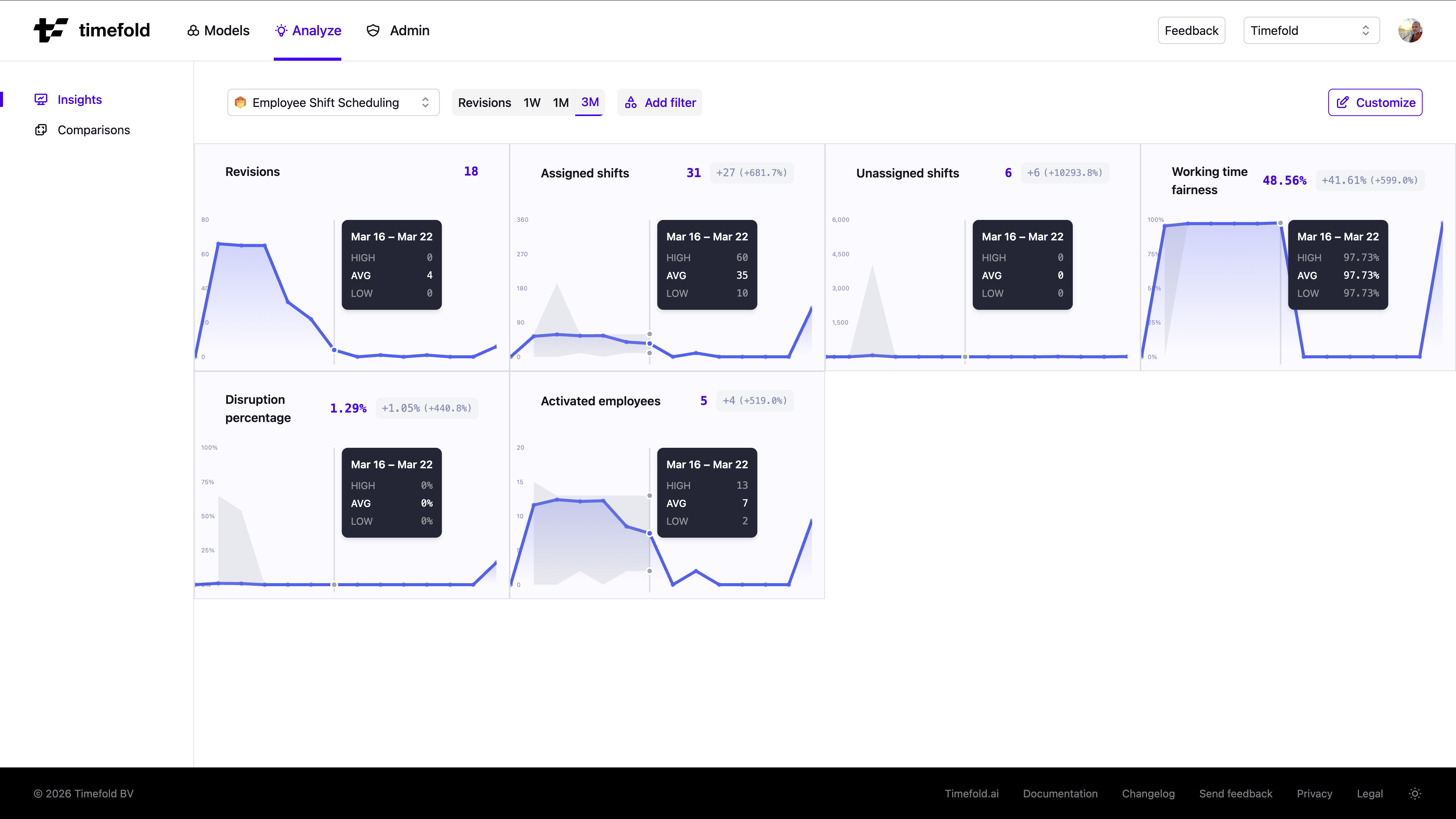
Revisions chart
At the top of the page, the Revisions chart shows how many datasets were submitted over time. This gives you a quick sense of submission cadence before looking at metric quality.
Metric charts
Each metric defined by the model is shown as an area chart. When the date range is set to 1W, 1M, or 3M, datasets are grouped by time period and each chart displays three bands:
-
HIGH: the highest value observed across datasets in that period.
-
AVG: the average value across datasets in that period.
-
LOW: the lowest value observed across datasets in that period.
The shaded area between the HIGH and LOW bands shows the spread of results. A narrow band means results are consistent; a wide band means there is more variation between datasets.
When the date range is set to Revisions, no grouping is applied and each data point represents a single dataset, so HIGH, AVG, and LOW all show the same value.
Next to the current metric value, a difference badge shows how the latest period compares to the preceding period of the same length (for example, "+8 (+48.8%)"). Hover over the badge to see an explanation of exactly which periods are being compared.
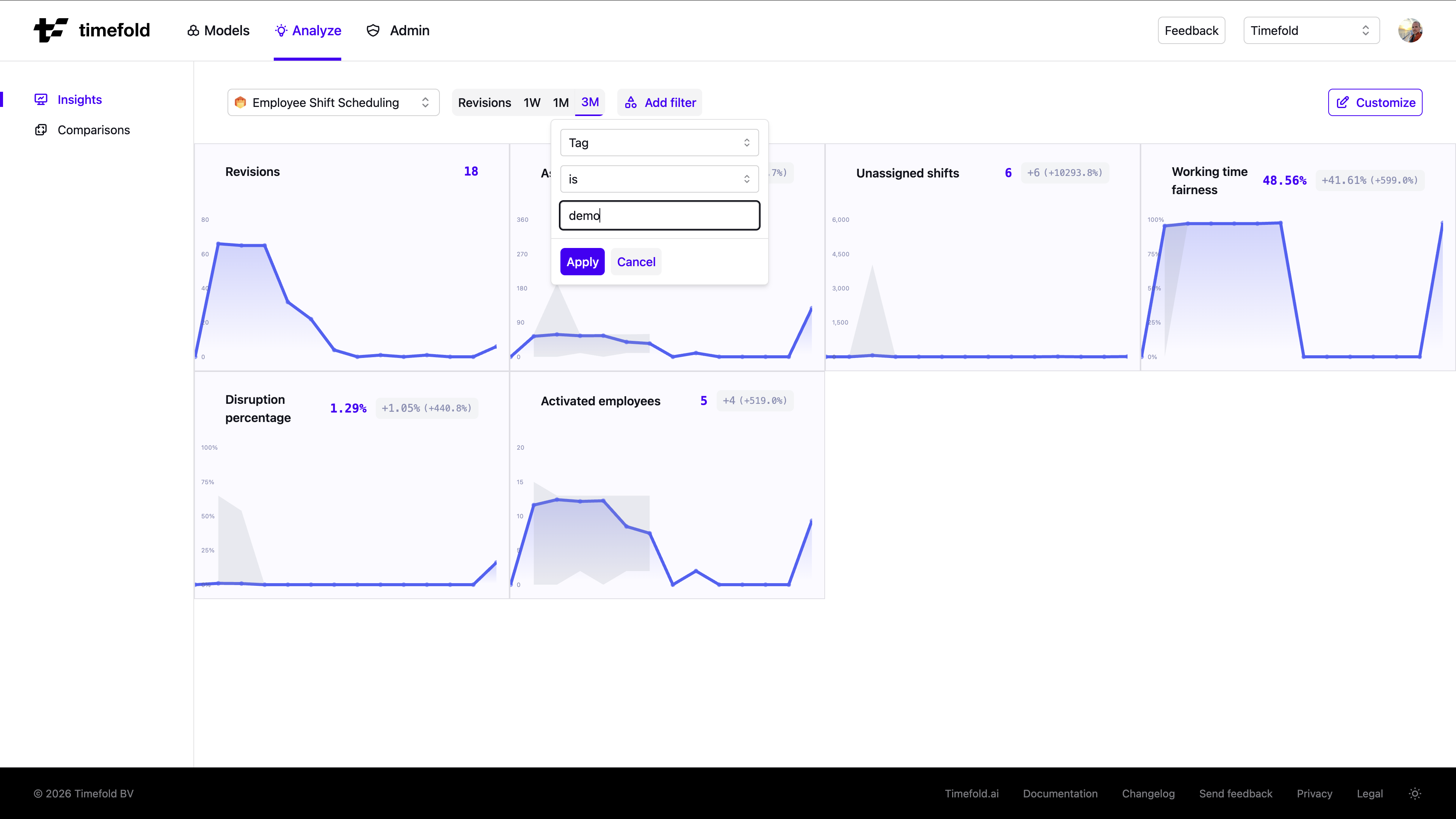
Filtering by tag
Tag filtering is the primary way to make Insights meaningful. Without a tag filter, the charts aggregate all datasets submitted to the model (potentially mixing weekly plans, daily revisions, datasets from different regions, or different business units). Comparing those together is comparing apples to oranges: trends become noise.
Click the Tag filter at the top of the page and type a tag to apply it. Only datasets with that tag are included in the charts. For example, filter on a region tag to see trends for one area of operations in isolation, or filter on a planning-type tag to track only weekly plans.
| Learn how to tag your datasets consistently in Searching and categorizing datasets for auditability. |
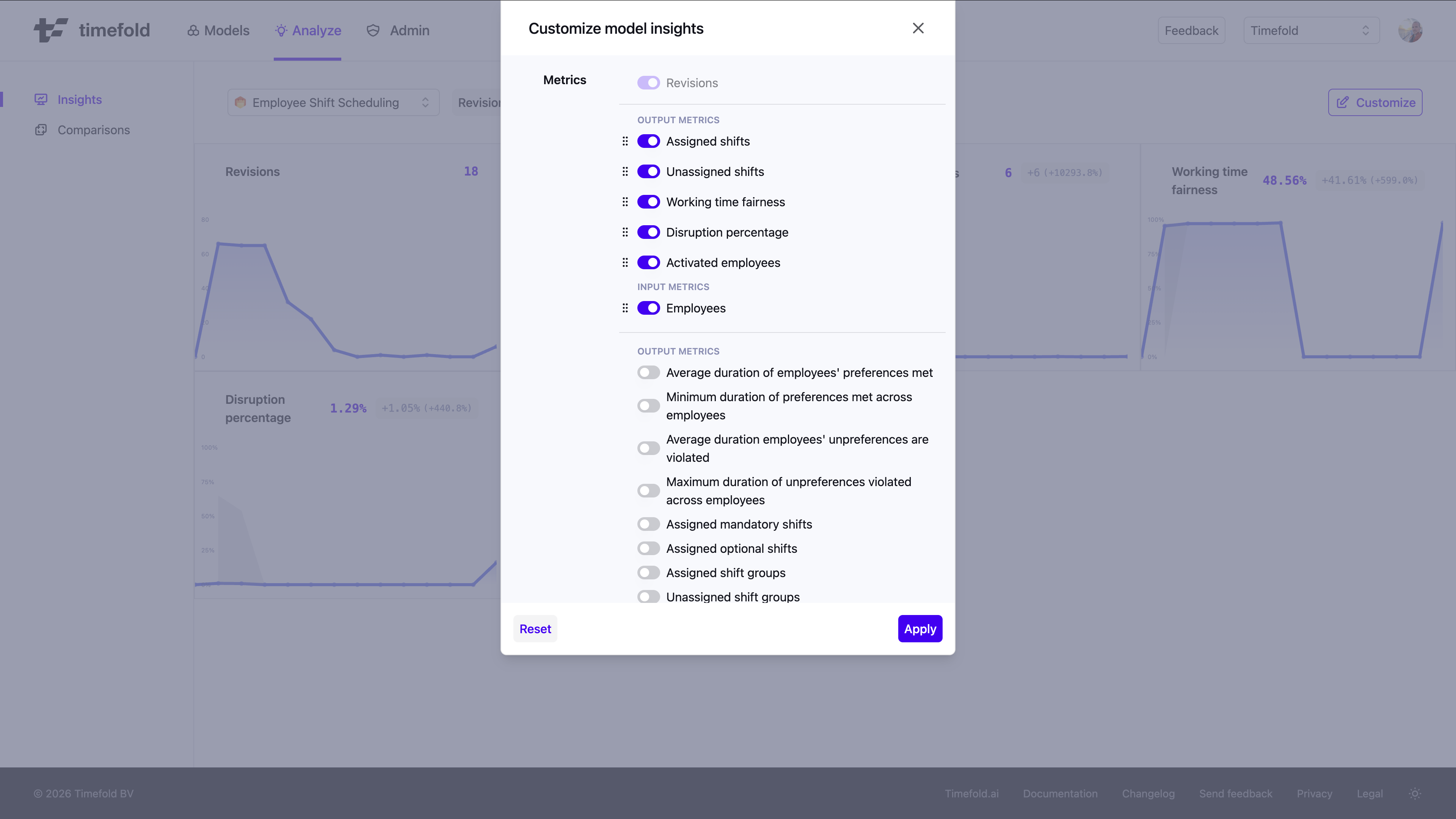
Customizing which metrics are shown
Click Customize to open the Customize dialog. Both input metrics (problem size indicators such as number of employees or shifts) and output metrics (solution quality indicators such as assigned shifts or fairness scores) are available. From there you can:
-
Show or hide metrics by toggling the visibility control next to each metric.
-
Reorder metrics by dragging the handle next to a metric name to the desired position.
The order and visibility you set are saved per model and persist across sessions.
Switching models
If your tenant has more than one model, use the model selector dropdown at the top of the page to switch between them. Each model has its own set of metrics, so the charts update to reflect the selected model’s KPIs.
Preview status
|
This feature is currently available as a preview feature. If you’d like early access to this feature, please Contact us. |