Efficiency X-Ray
Learn how to use the efficiency views in the Employee Shift Scheduling model to detect coverage, overtime, and fairness issues in an optimized schedule. These views work at a strategic level and help you identify systemic issues rather than isolated problems.
By employee
|
This visualization is currently available as a preview feature. To request early access to this feature, contact us. |
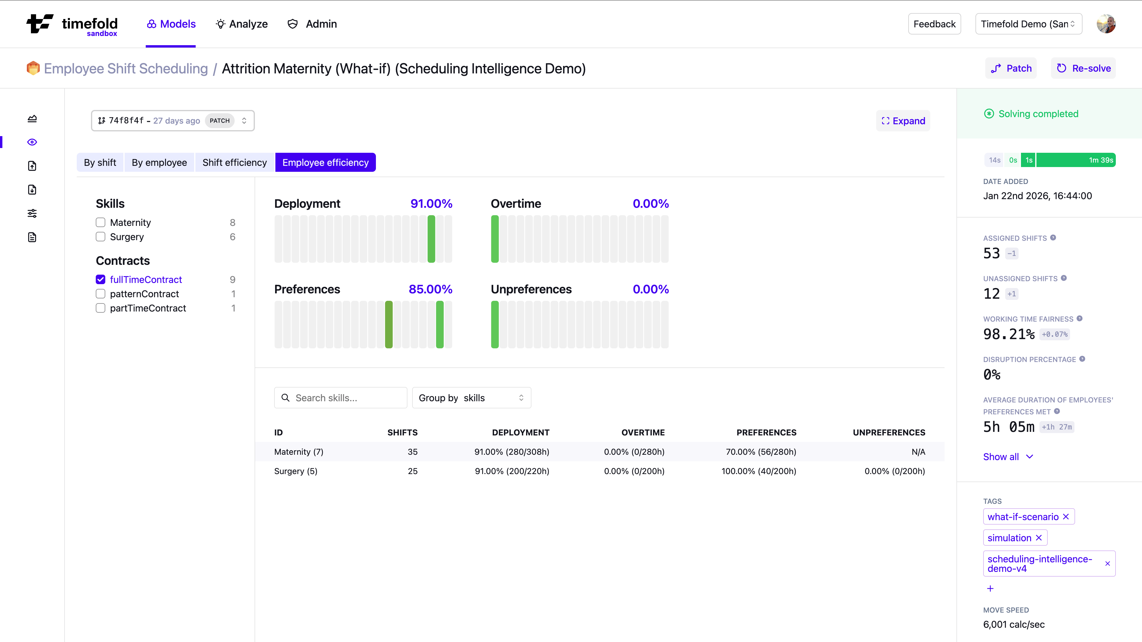
Primary focus: Strategic utilization and fairness.
The By Employee Efficiency X-Ray aggregates and visualizes employee metrics.
Understanding the employee metrics
The By Employee Efficiency X-Ray view surfaces four derived metrics per employee, each computed from the underlying Employee-level metrics returned by the API. A metric is only shown when the required contract rules or preference data are present for that employee. If a metric shows no data, the necessary input was not found in the schedule.
| Visualization metric | Derived from | Purpose |
|---|---|---|
Deployment |
|
How much of the employee’s available time is assigned to shifts. |
Overtime |
|
How much assigned time exceeds the employee’s preferred capacity. |
Preferences |
|
What percentage of assigned shift time falls within preferred time slots. |
Unpreferences |
|
What percentage of assigned shift time falls within unpreferred time slots. |
For a full description of each metric, when it is shown, and the raw API fields it is computed from, see Employee-level metrics.
Filters and controls
Every visualization view supports filtering. Click Filter in the view’s toolbar to drill down into a subset of the data. Combine multiple filters to narrow the view to exactly the data you want to inspect.
You can filter employees by:
-
Skills
-
Employees
-
Contracts
-
Risk factors
This allows you to focus on specific employee segments.
You can group results (for example by skill or contract type) to compare segments.
Distribution charts
The By Employee Efficiency X-Ray provides distribution charts. This is useful because averages might hide outliers. A small group of heavily overloaded employees may not be visible in average values.
The distribution charts show how deployment, overtime, preferences, and unpreferences are spread across employees or groups.
When to use
Use this view for high-level validation when you want to:
-
Compare deployment percentages across skills.
-
Identify underutilized contract types.
-
Detect whether a specific skill group experiences more overtime.
-
Assess fairness across the workforce, including fairness in deployment, overtime distribution, preference satisfaction, and unpreference violations.
By shift
|
This visualization is currently available as a preview feature. To request early access to this feature, contact us. |
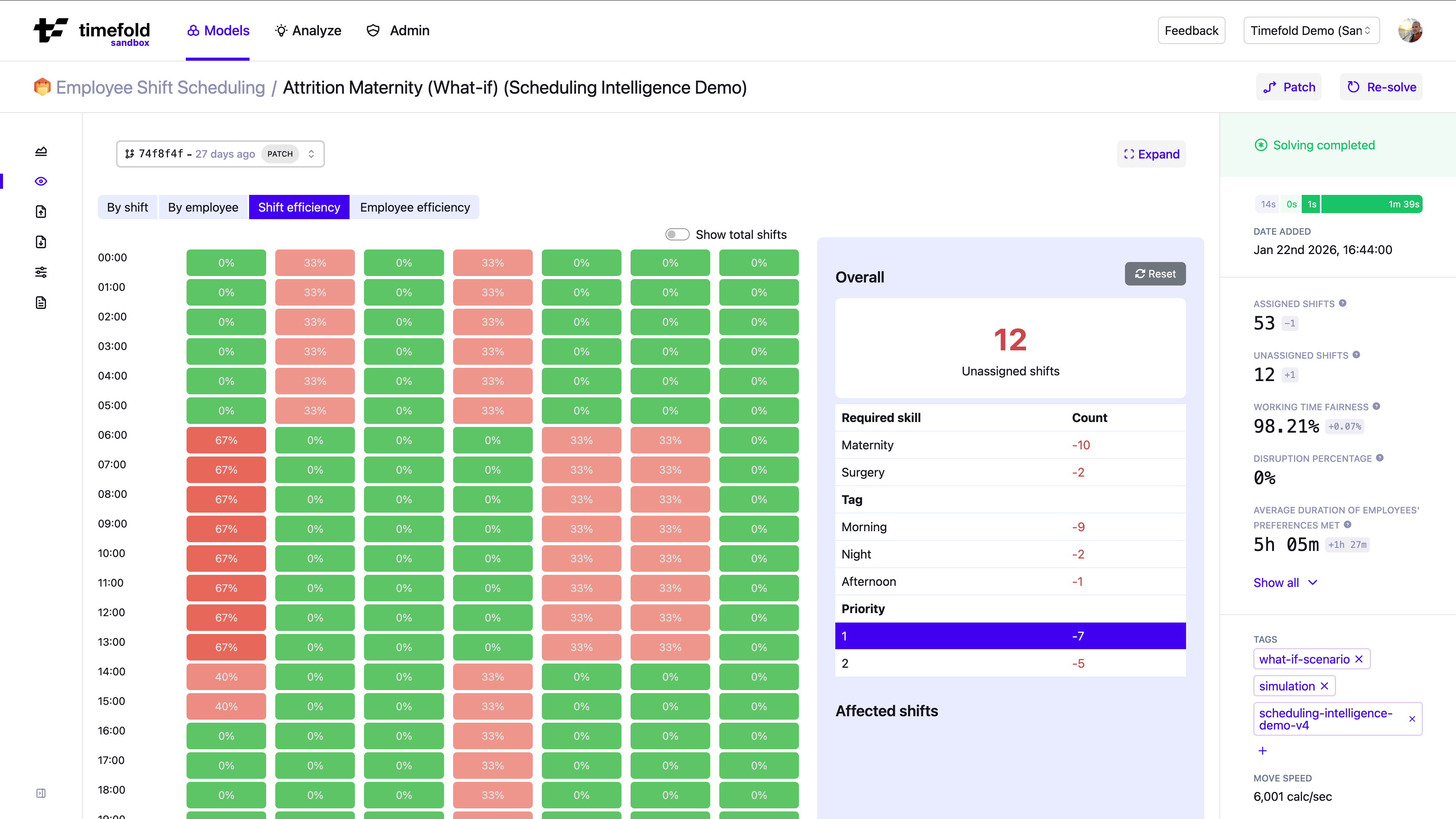
Primary focus: Time-based coverage bottlenecks.
The By Shift Efficiency X-Ray shows a grid with the hour of the day on the vertical axis and the day of the week on the horizontal axis.
Each cell represents the number (or percentage) of unassigned shifts that overlap that specific hour and day. A shift is counted in a cell if it has time within that specific hour of that specific day. For example: If a shift runs from 08:00–16:00 on Monday, it contributes to all Monday cells between 08:00 and 15:00.
Filters and controls
Every visualization view supports filtering. Click Filter in the view’s toolbar to drill down into a subset of the data. Combine multiple filters to narrow the view to exactly the data you want to inspect.
This view lets you filter by:
-
Skill
-
Tag
-
Risk Factors
-
Shift
-
Priority
This allows you to analyze unassigned shifts for a specific dimension.
You can also toggle Show totals. The UI will display how many total shifts exist in that time slot, allowing you to compare unassigned vs total demand.
Other views
The efficiency views show structural patterns across the schedule, but they don’t explain a specific assignment.
To inspect a specific shift or employee, use Visualization.
To check whether shifts were fillable at all before optimization, use Assignability analysis.
For a structured approach that combines all views, see the recommended analysis workflow.